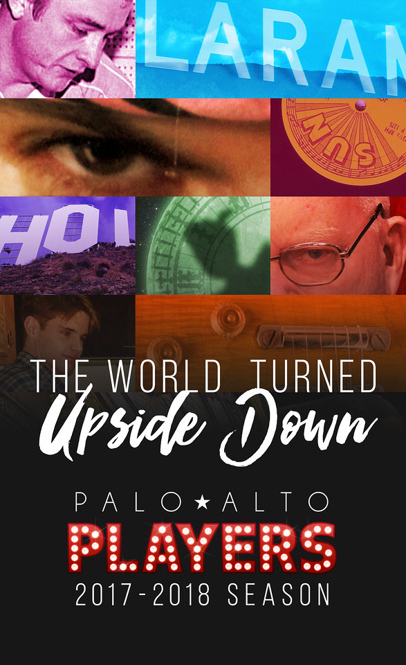
For the brochure cover design, I used close-ups from each of the posters. To represent the season theme of “The World Turned Upside Down” I vertically flipped a few of the images. To add cohesion to the disparate images, I added a dramatic color wash.
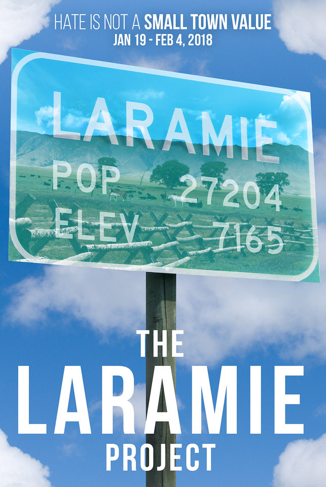
The Laramie Project discusses the juxtaposition of small town American beauty with a horrible act of violence. The poster features the Laramie road sign, the fence where Matthew Shepard was senselessly attacked, and the surrounding hills and bright blue sky. The coloring and main title font reflect the style used for the film’s poster.
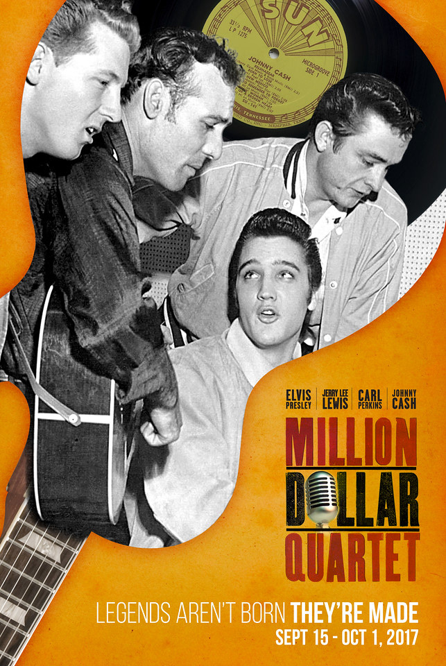
For the Million Dollar Quartet design, I used a combination of an upside down Gibson guitar, an amazing photo featuring the stars of show, and a Sun Records label. The warm orange coloring reflects the marketing materials created for the original Broadway and national tour productions.
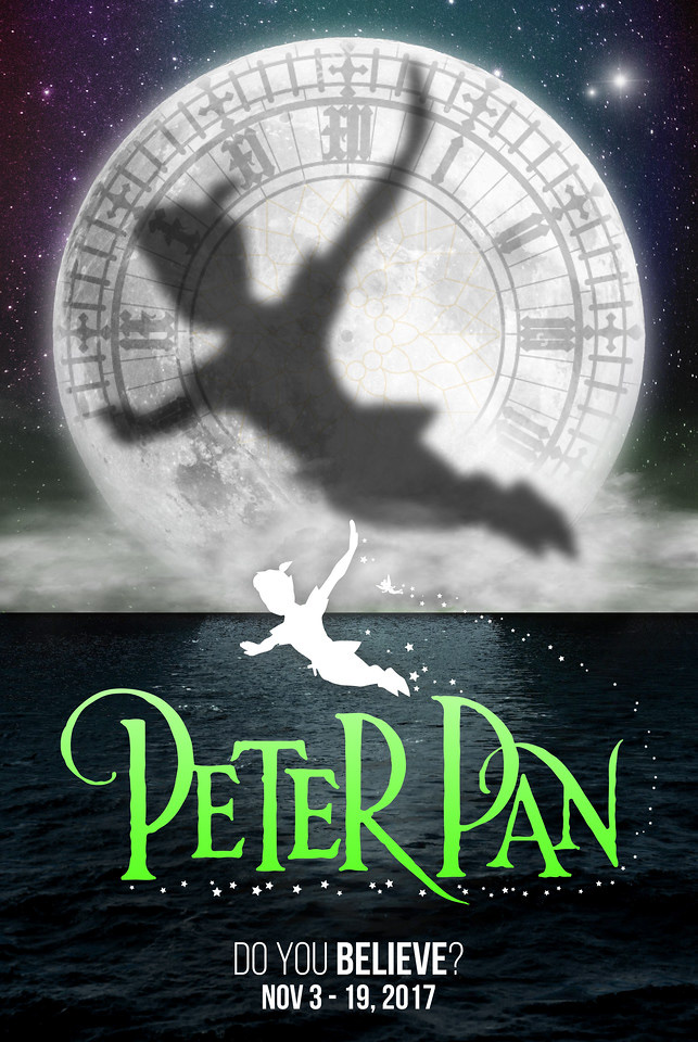
For the Peter Pan design, I featured Pan’s shadow flying (to the second star on the right) in front of a moon that features the face of Elizabeth Tower (more commonly known as Big Ben). The bright green, purple, and blues hues were used to give a magical / ethereal feel to the night sky.
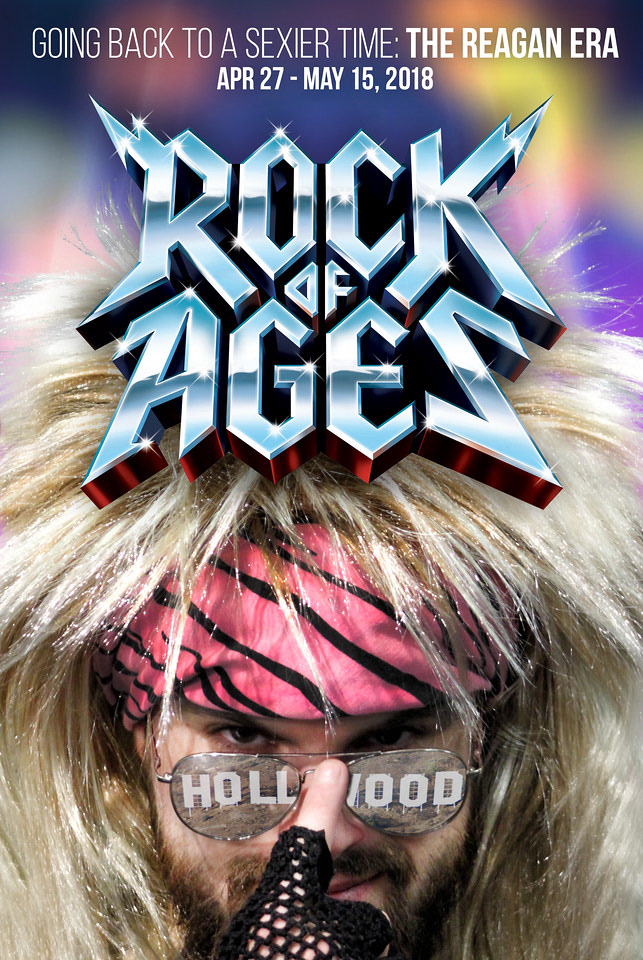
Rock of Ages is a show about the power of 80s rock music and love (in various forms) set in a transforming Los Angeles. To reflect the excess and coloring of the era, I doubled the amount of the model's hair, added a reflection of the Hollywood sign, and increased the vibrance of the bandana. The background coloring reflects the marketing materials created for the original Los Angeles and Broadway productions.
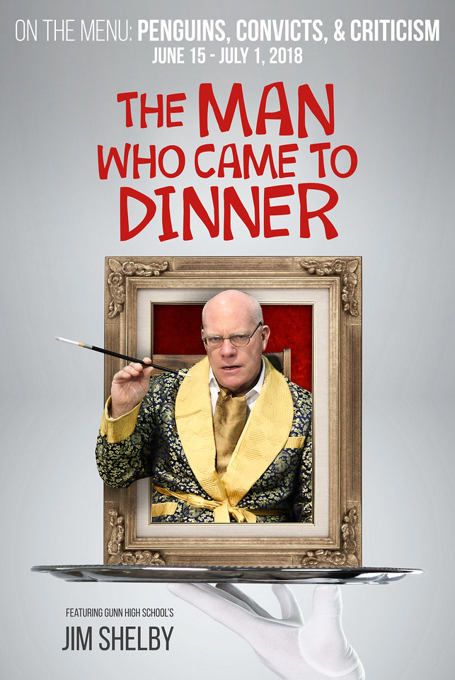
The marketing history of The Man Who Came to Dinner is an interesting one. Posters from past productions have featured penguins, a sarcophagus, vintage wheelchairs, Hirschfeld style drawings, radio microphones, and a dozen different color schemes.
The titular character demands that everyone cater to his every whim. Taking that idea quite literally, I had a butler serve the character to the audience on a platter.