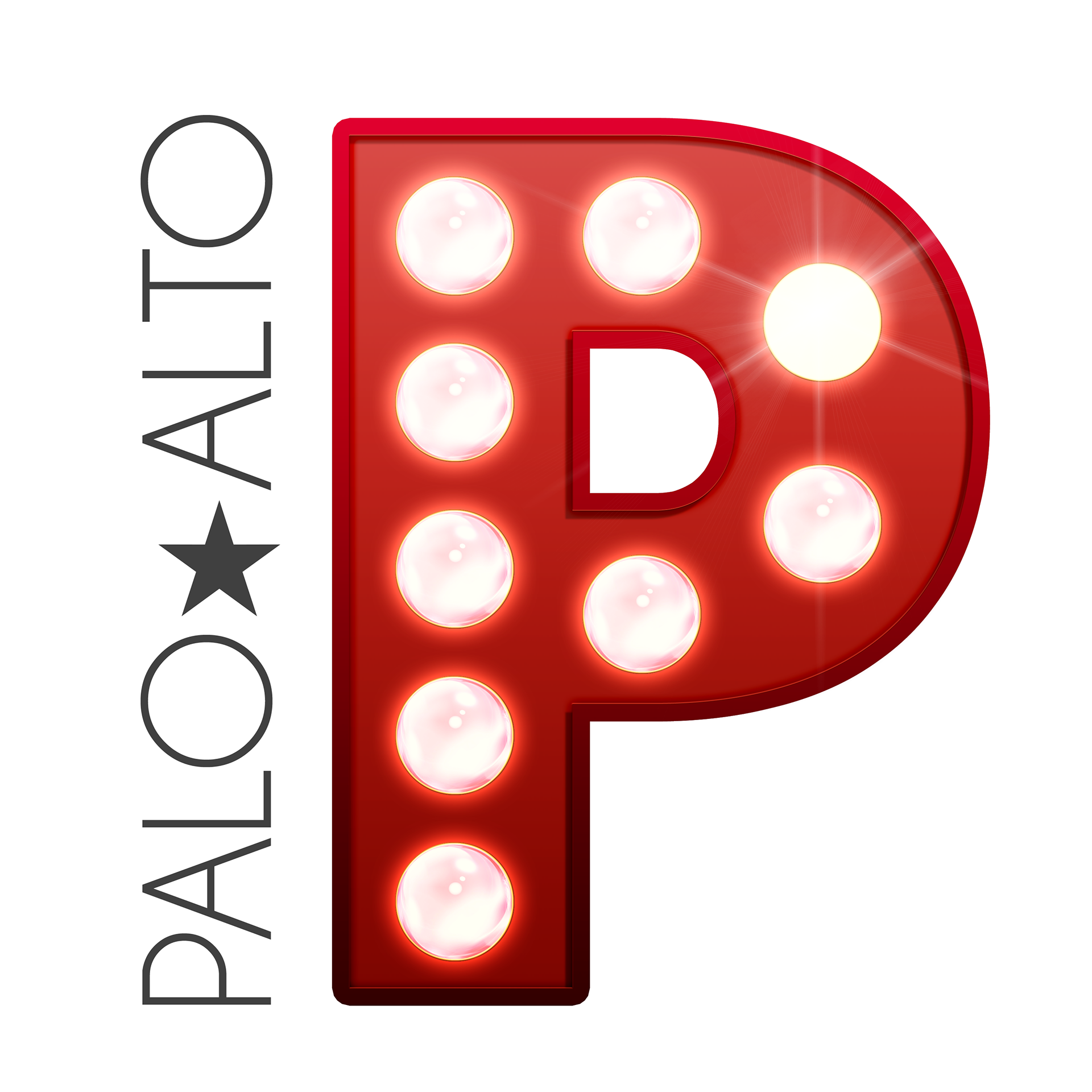
Single letter logo

Full logo


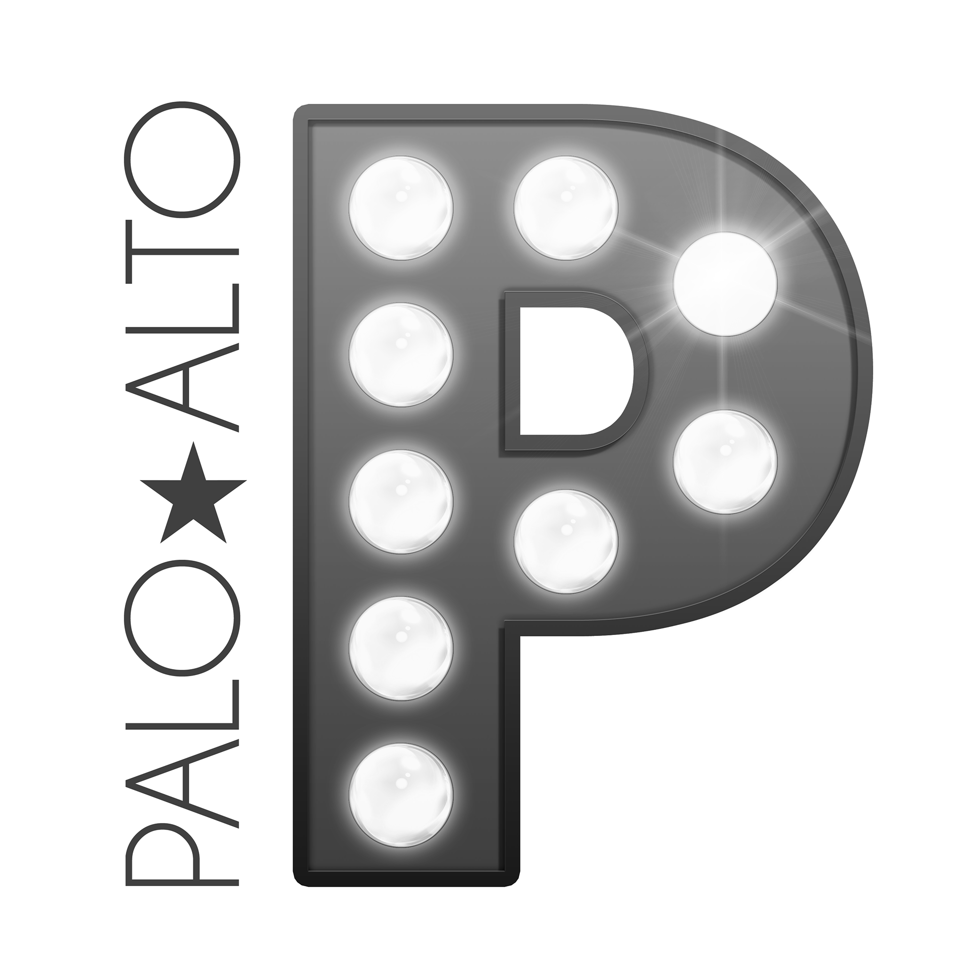
I was commissioned to design a logo for the Palo Alto Players theater group. The request was to create a logo that was recognizable from 50' away, but detailed and interesting from five feet away. The logo was designed to reflect the lights of Broadway, with a clear wordmark of Palo Alto to indicate the local community focus of the group. The star in the middle of "Palo Alto" was designed to reflect that the local community is the star of every production.